

Key Takeaways
Design Harmony
Design harmony is the quality that makes a room feel visually and spatially 'right' — comfortable to be in, pleasant to look at, and cohesive rather than chaotic. It isn't a single trick but the cumulative effect of decisions around scale, balance, contrast, and proportion working together. When these principles align, a room reads as intentional even if its individual elements are simple or inexpensive.
Interior designers often describe harmony through the Gestalt principle: the room is perceived as a unified whole before individual elements are noticed separately. Disruptions to scale or balance register as discomfort before most people can articulate why.
Scale: The Principle Rooms Get Wrong Most Often
Scale refers to the size of objects in relation to each other and to the room itself. When scale is off — an oversized sectional in a compact living room, or a tiny dining table dwarfed by a double-height ceiling — the room communicates discomfort before you can name why.
The practical fix is to measure before committing. Furniture that works in a showroom sits on a floor with no walls nearby; at home, the same piece may overwhelm the space. Sketch the footprint with painter's tape before buying anything substantial.
Scale also applies to décor. Artwork hung too small for a wall, or a pendant light too delicate for a large kitchen island, creates the same mismatch. As a starting point, treat eye level (roughly 57–60 inches from the floor) as the anchor for hanging decisions, and size groupings so they feel like one cohesive element rather than scattered dots.
Common decorating choices that unintentionally shrink rooms often come down to scale errors — furniture that's too large or too small for the space, and lighting that's the wrong proportion for the ceiling height.
Balance and Contrast: The Push and Pull of Visual Comfort
Balance is the distribution of visual weight throughout a room. It doesn't require matched pairs on either side of a fireplace — that's symmetrical balance, one valid option among several. Asymmetrical balance, more forgiving and often more interesting, means pairing a heavy dark armchair with a cluster of lighter elements — a floor lamp, a side table, a plant — that together equal its visual weight.
Contrast is balance's creative counterpart. Without contrast, rooms feel flat; with too much, they feel chaotic. The goal is deliberate tension: a matte linen sofa against a glossy tile floor, a rough-hewn wood coffee table alongside soft upholstery. These pairings create the kind of visual interest that keeps a room from feeling like a showroom display.
Test Scale Before You Commit
Before moving or purchasing furniture, use painter's tape on the floor to mark the exact footprint of each piece. Living with the taped outline for a day or two lets you evaluate traffic flow, visual weight, and proportion without the commitment — or the heavy lifting.
Unfamiliar with terms like visual weight or contrast ratio? The interior design glossary breaks down the vocabulary designers use every day, in plain language.
Repetition and Rhythm: How Rooms Feel Intentional
Repetition is the quiet engine of cohesion. When one element — a colour, a shape, a material — recurs across a room, the eye accepts the space as unified even if individual pieces were sourced from very different places. A warm brass tone in a lamp base, a drawer pull, and a mirror frame creates a throughline that reads as deliberate curation.
Rhythm in design is the spacing of those repeated elements — not too clustered, not too scattered. Interior designers sometimes describe it as the visual equivalent of a beat: predictable enough to feel settled, varied enough to stay interesting.
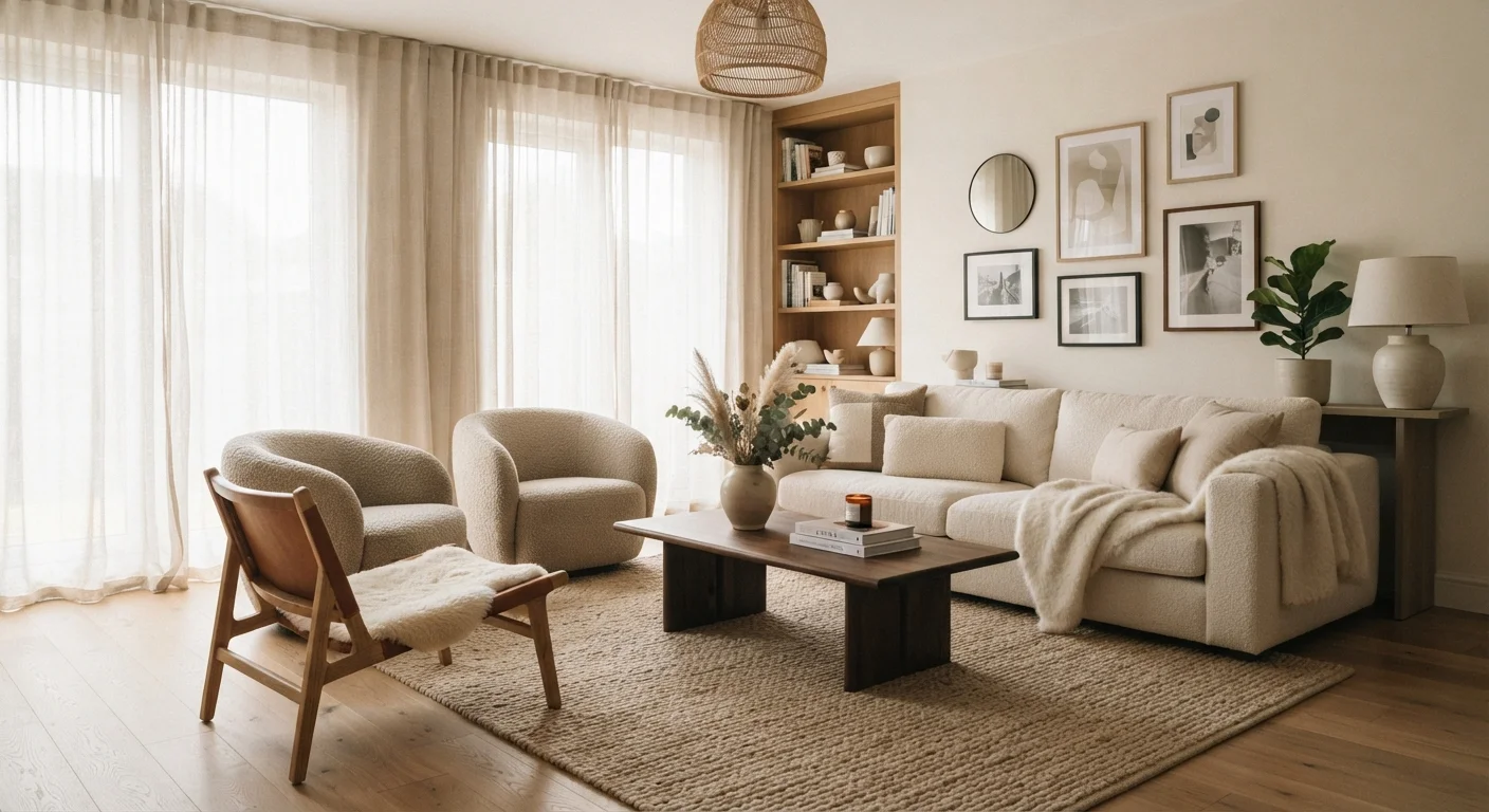
Texture is one of the most under-used tools for adding rhythm — layering smooth, rough, woven, and matte surfaces throughout a room creates depth that reads as considered rather than accidental.
If you suspect your rooms are close but not quite landing, the room-by-room décor audit offers a practical checklist for identifying what's holding each space back.