

Key Takeaways
Texture in Interior Design
Texture in interior design refers to the surface quality of materials and objects in a room — how they feel to the touch and how they appear to the eye. It encompasses both tactile texture (physical roughness, smoothness, or softness you can feel) and visual texture (the impression of surface variation created by pattern, sheen, or material contrast). Together, these qualities add depth, warmth, and character to a space that colour and layout alone cannot provide.
Designers often distinguish between 'actual texture' (physically felt) and 'implied texture' (perceived visually), both of which influence how light interacts with surfaces and how a room reads at different distances.
Why Texture Is the Missing Layer in Most Rooms
When a room feels somehow incomplete — pleasant enough, but lacking warmth or personality — colour and furniture arrangement are usually blamed first. More often than not, the real culprit is an absence of textural contrast. A space where every surface reads at the same visual weight — smooth walls, smooth sofa, smooth flooring — will feel flat no matter how carefully the colour palette was chosen.
Texture is the element that gives a room dimension. It's what makes a space feel inhabited and considered rather than staged. And because it operates on both a physical and a visual level, it influences a room in ways that are felt as much as seen. For a broader grounding in design vocabulary, our glossary of interior design terms is a useful starting point.
Texture Works Alongside Colour, Not Against It
Texture and colour are not competing design tools — they interact. A monochromatic room (one built primarily on a single colour family) especially depends on textural variety to avoid feeling flat. When colour contrast is low, surface contrast carries more of the room's visual interest. This is why all-white or all-neutral rooms can look stunning with strong textural layering, but stark without it.
Tactile vs. Visual Texture: Understanding Both
Tactile texture is what your hand registers — the nubby weave of a linen pillow, the cool smoothness of a ceramic lamp base, the grain of a raw oak tabletop. It's the most intuitive form of texture because it's physical and immediate.
Visual texture is subtler. It's the impression of surface complexity your eye reads without any direct contact. A grasscloth wallcovering viewed from across the room, a herringbone tile floor, or a bouclé sofa all create visual texture — a sense that surfaces are active rather than inert. Paint finish falls squarely into this category: a matte wall reads as soft and recessive, while a satin finish introduces a gentle surface energy. See how those choices play out in practice with our guide to interior paint finishes.
Neither type is more important than the other. The most effective rooms work with both simultaneously.
2–3
Recommended distinct surface types per room
Interior design practitioners commonly recommend pairing at least two to three contrasting surface qualities — soft, hard, and textured — to create visual balance in a space.
~60%
Of a room's texture comes from soft furnishings
Rugs, curtains, upholstery, and bedding collectively account for the majority of tactile texture in most residential rooms, making them the highest-leverage starting point for change.
How to Layer Textures Without Chaos
The principle behind effective texture layering is contrast. A single dominant texture — even a beautiful one — becomes background noise. Pairing it with something that differs in surface quality, weight, or sheen is what makes both elements register.
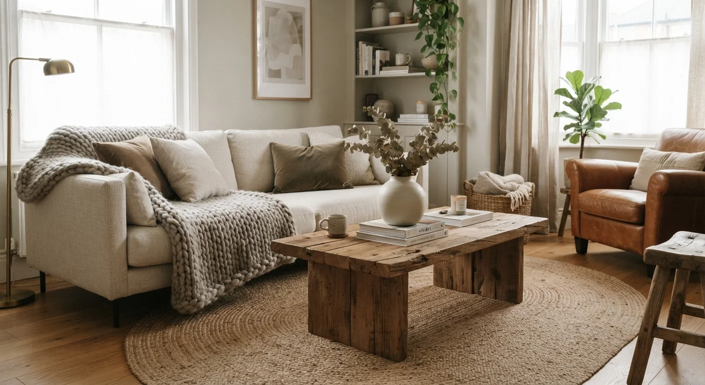
A practical starting framework: anchor the room with one or two substantial textures (a natural wool rug, a linen sofa), then introduce contrast through smaller elements (smooth ceramic, polished metal hardware, glass). The rule of thumb used by many designers is to include at least three different surface qualities in any one room — soft, hard, and something in between.
Natural materials are especially useful here because they carry inherent texture. Stone, wood, linen, and rattan each read differently at close range and from across a room. Our comparison of natural materials in the home explores their individual qualities in detail.
Start With What You Can Feel
When auditing a room's texture, run your hand across surfaces as you move through the space. If everything you touch feels the same, the room likely looks flat too. Identify one surface to swap or layer — a smooth throw pillow cover replaced with a nubby linen, for example — and observe how the overall impression of the room shifts before committing to larger changes.
Texture and Light: An Underappreciated Relationship
How light behaves in a room is directly tied to the surfaces it encounters. Rough, matte textures — raw plaster, unfinished wood, thick weaves — scatter and absorb light, which reads as warmth and intimacy. Smooth, reflective surfaces — polished stone, glass, lacquered finishes — bounce light around, adding brightness and a sense of openness.
This means texture is a legitimate tool for shaping a room's mood, working in parallel with your lighting choices. A north-facing room with low natural light benefits from a mix of reflective and light-absorbing surfaces rather than going entirely matte, which can tip into gloominess. For more on how to shape a room's atmosphere, our guide on layering light pairs naturally with this topic.
Simple Ways to Add Texture Starting Today
Significant texture changes don't require renovation. The most accessible levers are soft furnishings and accessories — areas where you can experiment without commitment.
- Layer rugs: A jute or sisal rug under a softer wool or cotton layer adds immediate tactile contrast underfoot.
- Mix pillow and throw materials: Combine smooth velvet with nubby linen or chunky knit for textural variety on a sofa or bed.
- Introduce plants: Leaf surfaces — smooth, waxy, fuzzy, or strappy — add organic visual texture that's hard to replicate with manufactured objects.
- Change your lamp shades: Swapping a smooth shade for a woven or pleated one changes the quality of light and adds surface interest simultaneously.
- Consider your wall finish: Even within the same colour, switching from flat paint to eggshell or adding a limewash technique introduces wall texture without a full repaint.
Once you start looking for texture intentionally, you'll notice it shapes how every room you walk into feels — which is precisely why it's worth taking seriously. For more on the underlying principles that make rooms feel cohesive, see the principles behind rooms that feel just right.