

Key Takeaways
Colour Temperature
Colour temperature describes the warmth or coolness of a light source — or the visual tone of a paint colour — measured in a way that affects how a space feels emotionally and practically. Warm colours (reds, yellows, ambers) create a cozy, intimate atmosphere, while cool colours (blues, greys, crisp whites) tend to feel crisp and energising. It's one of the most powerful — and most overlooked — tools in interior design.
When referring to light bulbs, colour temperature is measured in Kelvins (K). Bulbs around 2700K–3000K emit warm white light; 4000K–5000K produces a neutral to cool white; 6500K mimics daylight.
Why Colour Temperature Matters More Than You Think
Walk into a restaurant bathed in amber candlelight and you instantly relax. Step into a bright white-lit office and your mind sharpens. That shift in mood isn't just psychological habit — it's colour temperature at work. Whether it comes from a paint colour on your walls or the bulbs in your fixtures, the warmth or coolness of light fundamentally changes how a room feels to be inside.
Most decorating decisions focus on furniture placement, fabric choices, or accent colours. Colour temperature tends to be an afterthought — chosen when picking a bulb at the hardware store or defaulting to whatever white paint looks nice on a swatch. Understanding it intentionally gives you one of the most effective tools for shaping atmosphere without moving a single piece of furniture. For a broader look at how these invisible forces combine, see our guide to rooms that feel 'just right'.
2700K
Typical warm white bulb colour temperature
Bulbs in the 2700K–3000K range are widely recommended by lighting designers for living and sleeping spaces due to their flattering, relaxing quality.
~90%
Colour rendering accuracy of high-CRI bulbs
Bulbs with a Color Rendering Index (CRI) of 90 or above reproduce surface colours — including wall paint — much more accurately than standard bulbs.
Warm vs. Cool: What Each Temperature Does to a Space
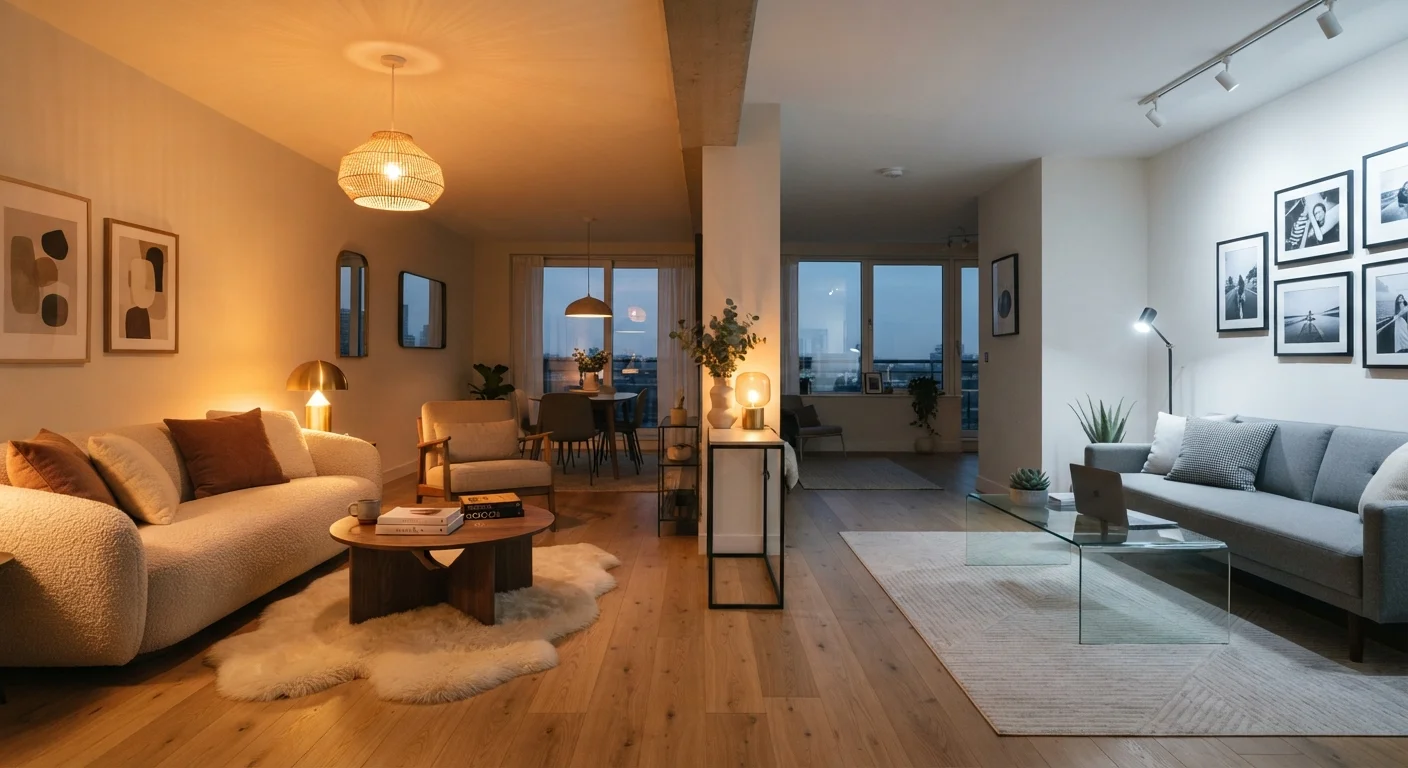
Warm colours — think deep reds, golden yellows, earthy terracottas, and soft ambers — visually advance toward the viewer. They make walls feel closer and spaces feel snugger. In a large, underscaled room, a warm palette adds the intimacy that scale alone can't provide. In a light source, warm white bulbs (2700K–3000K) cast a flattering glow well-suited to living rooms and bedrooms.
Cool colours — slate blues, sage greens, crisp whites with grey or blue undertones — do the opposite. They visually recede, making rooms feel more open and airy. They also promote alertness, which is why kitchens, home offices, and bathrooms often benefit from cooler tones. In bulb terms, 4000K–5000K sits in the neutral-to-cool zone and suits task-heavy spaces well.
Neither warm nor cool is inherently superior — the right choice depends on the room's function, its natural light, and the mood you want to cultivate. A common decorating misconception is that cool colours always make rooms feel cold or unwelcoming. Our article on interior design myths addresses exactly that kind of assumption.
Test Your Bulb and Paint Together
Before committing to a paint colour, view your large sample board under the specific bulbs you plan to use — both during the day and in the evening. What looks like a clean warm white under daylight can shift noticeably under a 2700K lamp. This one test can save you from a costly repaint.
Light Bulbs, Paint Undertones, and How They Interact
Here's where many decorators get tripped up: your wall paint colour and your light bulb temperature don't operate independently. A warm 2700K bulb will amplify the peachy or yellow undertones in a paint colour, potentially making a shade you loved in the store look overly yellow at home in the evening. A cooler bulb will pull grey and blue undertones forward, sometimes making a 'warm white' paint look almost lavender.
This interaction is why testing is non-negotiable. Paint a large sample board — at least 12 by 12 inches — and observe it under the actual lighting conditions you plan to use: morning sun, afternoon shade, and the evening artificial light. Don't rely on a paint chip under a store's fluorescent lighting. If you're unsure about design vocabulary like 'undertone' or 'colour rendering,' our interior design glossary is a useful reference.
CRI Matters as Much as Kelvin
Colour temperature (Kelvin) describes the warmth or coolness of a light source, but Colour Rendering Index (CRI) measures how accurately that light reveals the true colours of surfaces. A bulb can be warm-toned but still make paint and fabrics look muddy if its CRI is low. For living spaces, look for bulbs with a CRI of 90 or higher alongside your preferred Kelvin value.
Applying Colour Temperature Room by Room
Different rooms call for different temperature strategies. Bedrooms almost universally benefit from warm light and warm paint tones — they signal to the brain that it's time to wind down. Living rooms can lean warm for everyday comfort but may benefit from a neutral midpoint (around 3000K–3500K in bulbs) if they double as reading or work spaces.
Kitchens and home offices tend to work best with cooler, higher-contrast lighting that supports focus and accurate colour perception when preparing food or working on screens. Bathrooms are a balancing act: too warm and it's difficult to apply makeup accurately; too cool and the space can feel clinical.
Light layering matters enormously here. A single overhead fixture forces the whole room into one temperature. Adding table lamps, floor lamps, or accent lighting at different positions — and potentially different Kelvin values — lets you shift the mood by zone or by time of day. Our guide to layering light walks through this approach in detail. Colour temperature also works alongside texture to create rooms with depth and warmth rather than flat, one-note atmospheres.